HERO SECTIONS
The importance of the first look.
Black friday hero section

The challenge
Create an eye-catching Black Friday discounts page.
Why these choices?
I created a bit of tension by choosing to cut the image with an oblique line and enlarging the photo by cropping part of the subject to increase the interest.
I used an easy to read font for an immediate effect by leaving the weight on the words ‘Black Friday’ and ‘discounts’ and lightening the words ‘are here’.
To give a bit of lightness I preferred to use a colour that clearly recalls the photo, both for the part of the title which I didn’t want to stand out too much and for the text.
To highlight the CTA I instead used a beautiful BF9CBF, a complementary colour to the main colour of the photo, and which stands out well from everything else, attracting the desired attention.
The father hero section
The challenge
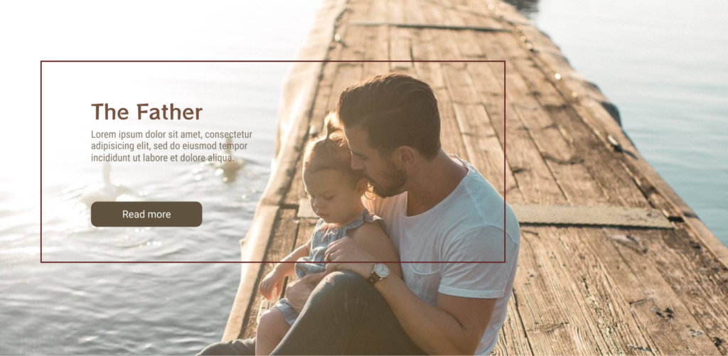
Finding the perfect visual harmony between photo, font and colour, starting from the photo and playing with the contents for a perfect result. But what does ‘perfect result’ mean? I started by analysing the elements of the photo.
Why the title font?
The wood, a prominent element of the photo, evoked a sense of strength and support that takes me back to the figure of the father: strong, supportive. This is why I chose the RocknRoll One font: the variable thickness of the strokes of this font is very reminiscent of wood. RocknRoll One is also a playful font perfect for the figure of a modern dad. However, I decided to keep the title a little small so that it wasn’t too dominant in order to maintain the general feeling of warmth emanating from the hug between father and daughter in the foreground and the warm colors of the photo.
Why the rectangle?
To enhance the embrace I decided to use a rectangle that embraced the title, the text and the image creating continuity and a sense of whole. However, choosing not to round the corners of the rectangle to maintain the sense of wood and solidity.
Meditation website hero section
The challenge
Choosing the right image, fonts and colors for a meditation website landing page.
Why the image colour and the frame?
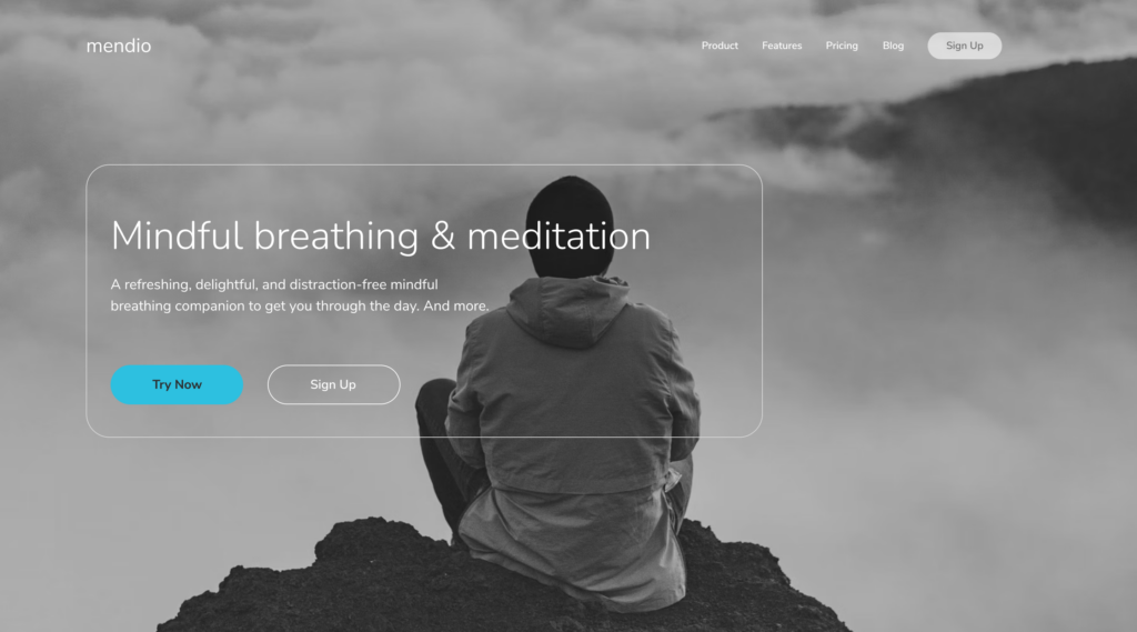
Desaturated photos to give a sense of peace and relaxation.
The frame connects the photo to the text and has rounded edges and a thin stroke to maintain a soft and light appearance. Grayscale also helps the colour of the call to action stand out.
Another version
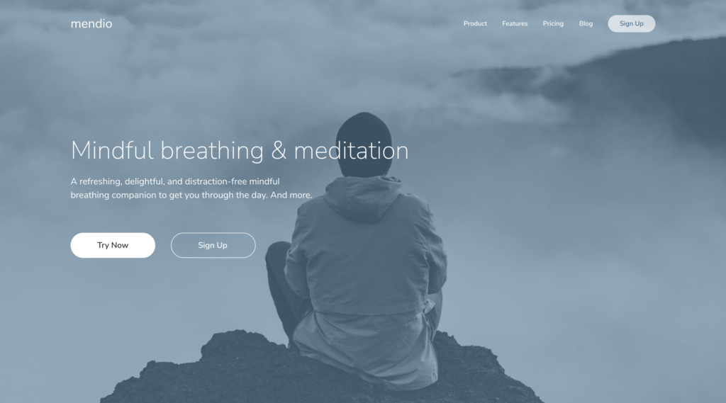
A new version that maintains the feeling of serenity using the Tinting technique (desaturation and apply a semi-transparent layer of color over image).
Divorce attorney hero section
First draft: what’s wrong
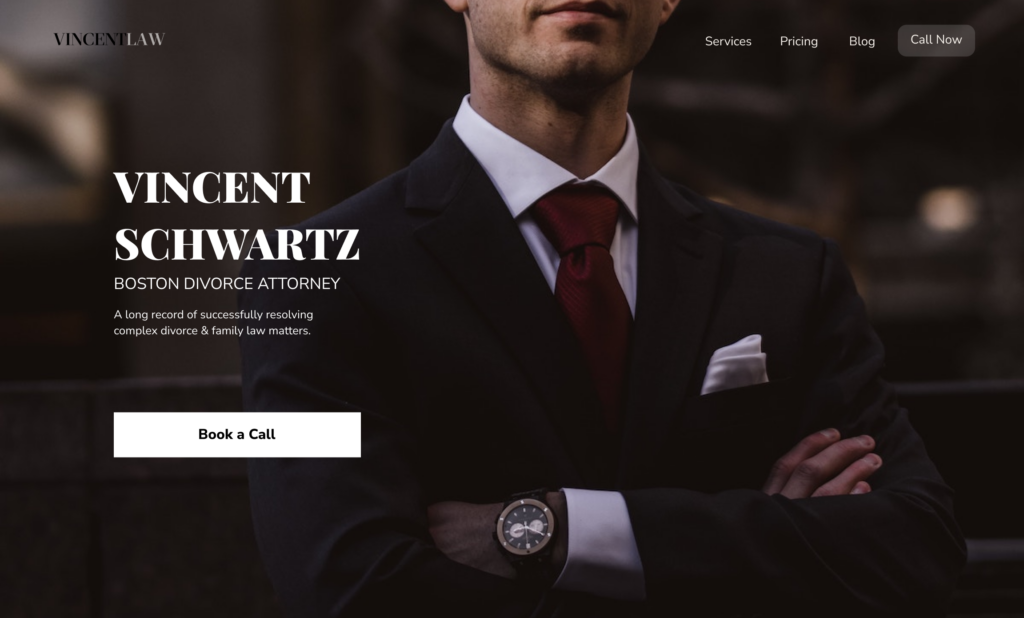
The first draft featured a photo cropped to face level to create mystery and increase interest. The idea seemed good but it didn’t match what a lawyer’s website should convey: trust.
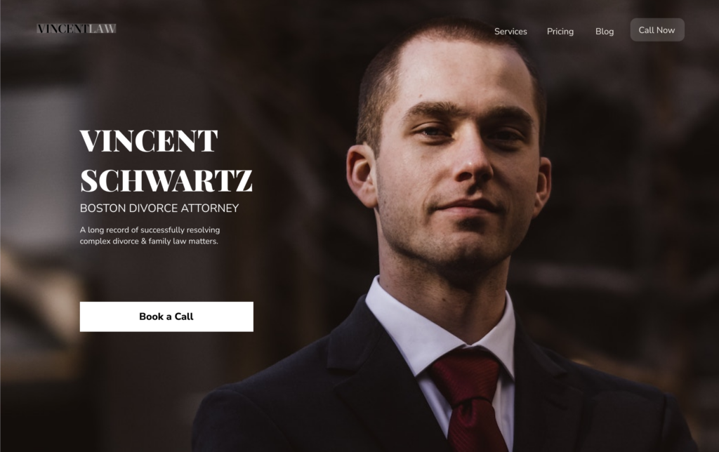
Second draft: better but…
The second draft was certainly more in line with the figure of a divorce lawyer. He was trustfull but lacked something… a little oomph.
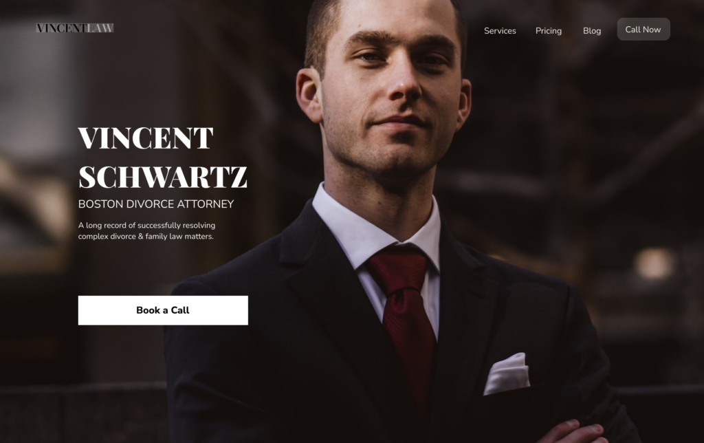
Final version
This is why the choice was made to reveal more of the body so that he could notice the posture with crossed arms. He gets the message across: ‘You can trust me, we will fight together’.
