ARTIST PORTFOLIO
From unsuccessful to a clear and appealing art portfolio
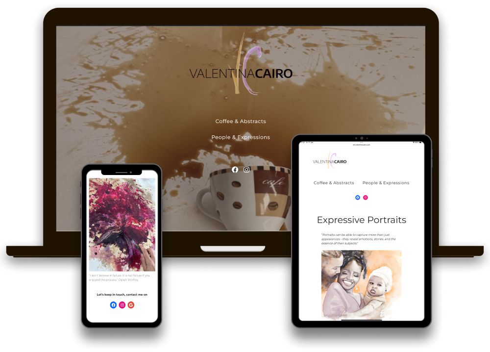
About the project
An outdated and confusing art portfolio website is far from the ideal showcase for an emerging artist, especially in an era where clear information and standing out are essential. The original site lacked clarity, structure, and basic functional elements such as artwork descriptions, dimensions, and contact details, making it difficult for potential buyers or art enthusiasts to engage with the artist’s work.
Role & responsibilities
- Conducting research into the user experience and identifying the pain points.
- Redesigning the user interface to improve visual appeal, accessibility, and functionality.
Project goals
Improve the desktop website experience to increase the number of people who complete the booking process.
- Clearly present the artist’s work, including relevant details (size, technique, pricing, and descriptions).
- Improve the overall user experience by focusing on simplicity, accessibility, and clarity.
- Encourage potential buyers or art collectors to contact the artist, either via social media or a contact form.
Phase 1: research
Defining the tone and values
A key aspect of this project was aligning the website’s tone and personality with the artist’s unique identity and creative process. The brand values I focused on were: Creativity, Clarity, and Authenticity.
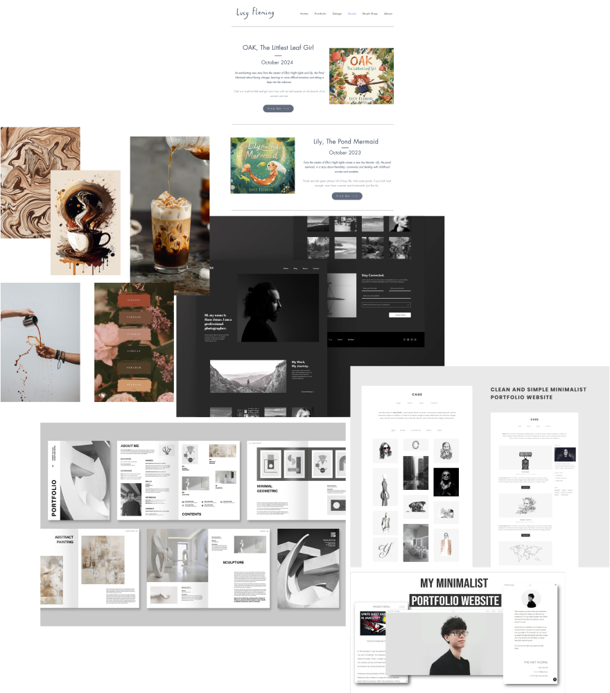
To capture these elements, I created a mood board of visual references that inspired the redesign. This served as both a source of inspiration and a way to communicate my ideas effectively during the design process.
Researching the Market
I started by analyzing competitor websites in the art and creative industries, including photographers, painters, and illustrators. This helped me identify best practices and trends while spotting opportunities for differentiation. I focused on Websites with minimalist designs and ample white space were easier to navigate and allowed the artwork to stand out and portfolios that told a story about the artist’s process.
Moodboard Highlights
- Color Palette: A blend of coffee-inspired tones (browns, warm neutrals) for the landing page and clean whites for the artwork pages to emphasize brightness and vibrancy.
- Typography: Elegant, modern fonts with strong readability to balance creativity and professionalism.
- Imagery: Examples of large, high-quality artwork displays alongside subtle storytelling elements like captions and process snapshots.
Phase 2: analyse the research data
Identify the problem
The initial website was cluttered and difficult to navigate. Many users did not understand the paintings’ dimensions, lacked clarity about how to reach out to the artist, and struggled to understand the artist’s process. There was no narrative or cohesive story that tied the artist’s work together.
To identify the pain points and opportunities for improvement, I took the following steps:
- User Interviews: I spoke with users who had visited the site in the past to identify what they found confusing or frustrating.
- Competitive Analysis: I reviewed other art portfolio websites to benchmark design trends and identify what worked well in terms of user experience and aesthetics.
- Usability Testing: I ran tests on the original site to observe where users were getting stuck and which areas caused frustration.
Gathering requirements
After conducting my research, I compiled a list of key insights:
- Cluttered design: Users felt overwhelmed by too many images displayed at once without any clear hierarchy or context.
- Lack of information: There were no descriptions of the paintings, leaving visitors uncertain about the paintings’ size and materials used.
- Difficulty in reaching out to the artist: Contact information was buried on the site, making it difficult for potential buyers to connect.
To address these problems, I decided on the following changes:
- A more intuitive layout that highlights artwork, making it the focal point of the site.
- Clear and concise descriptions under each painting, including size, materials, technique.
- Multiple ways to reach the artist via the Hero section, top bar and footer.
Redesign strategy
I approached the redesign with the following principles:
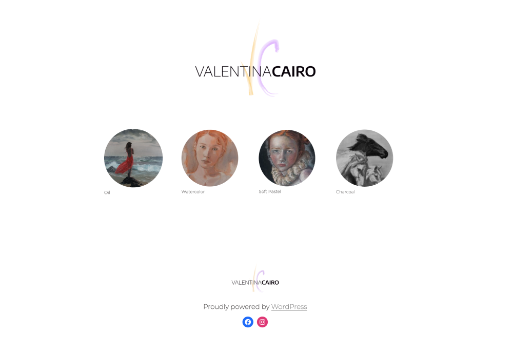
Simplified Navigation: I wanted to ensure users could easily explore the portfolio, choose between categories (Coffee & Abstracts or People & Expressions), and find relevant information on the paintings quickly and a way (via social media) to connect to the artist.
Visual Hierarchy: The site’s layout needed to be visually clean and guide the user’s eyes toward the artwork, not distract them with unnecessary clutter.
Modern Aesthetic: I incorporated bright, white backgrounds to make the colorful artwork stand out.
Phase 3: defining the UI
Let’s solve the problems!
By this stage, I had identified the main challenges and opportunities for improvement. These insights provided a framework for me to design a visually appealing, user-friendly portfolio that highlighted the artist’s work while ensuring clarity and accessibility.
Landing page
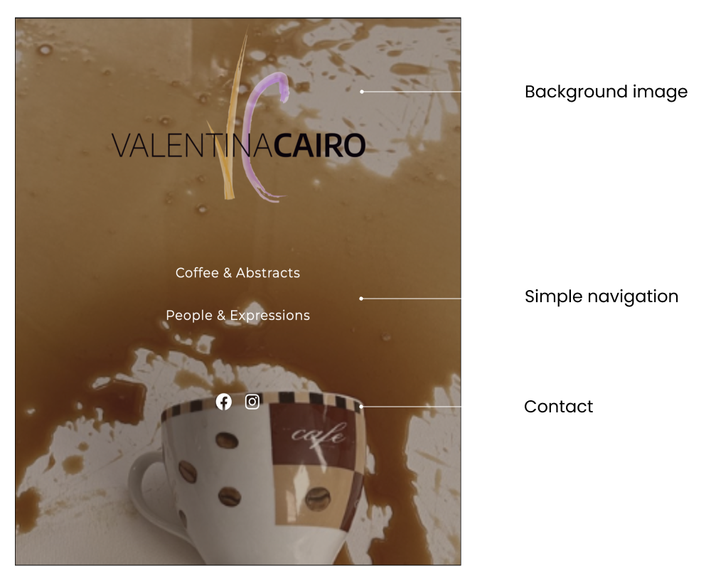
The landing page set the tone for the entire site, featuring:
- A dark, coffee-inspired theme with warm brown tones to reflect the artist’s unique style of using coffee in their paintings.
- A central splash image of coffee splattering on a canvas, evoking curiosity and creativity.
- Clear navigation to two main categories: Coffee & Abstracts and People & Expressions.
- Big Social icons to reach out to the artist.
Artwork Pages
For each category page, I prioritised:
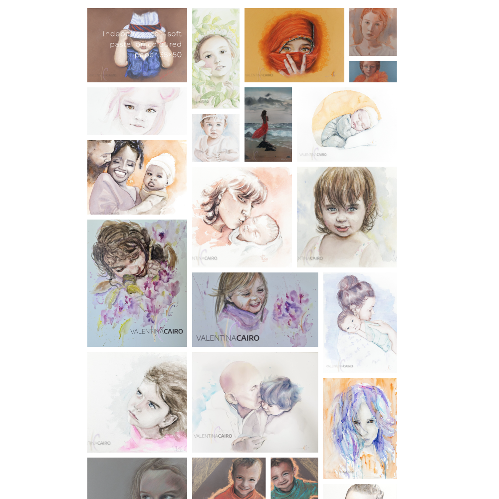
- A bright, minimalist design with a white background to let the vibrant artwork take centre stage.
- Large, high-quality images accompanied by brief but informative descriptions, including dimensions, techniques, and materials.
- A consistent layout that encourages users to scroll down and immerse themselves in the artist’s work.
- Multiple ways to reach the artist via the top bar and footer.
Contact Integration
To address the lack of clear communication options, I added:
- A sticky header with social media links and a contact button.
- A footer containing all contact details for quick reference.
- A final CTA at the end of each page encouraging users to connect with the artist.
Landing page: simple and intuitive
Background image: A central splash image of coffee splattering on a canvas, evoking curiosity and creativity.
Simple navigation: Clear navigation to two main categories: Coffee & Abstracts and People & Expressions.
Contact: Include large icons to easily connect to the artist
Artwork pages
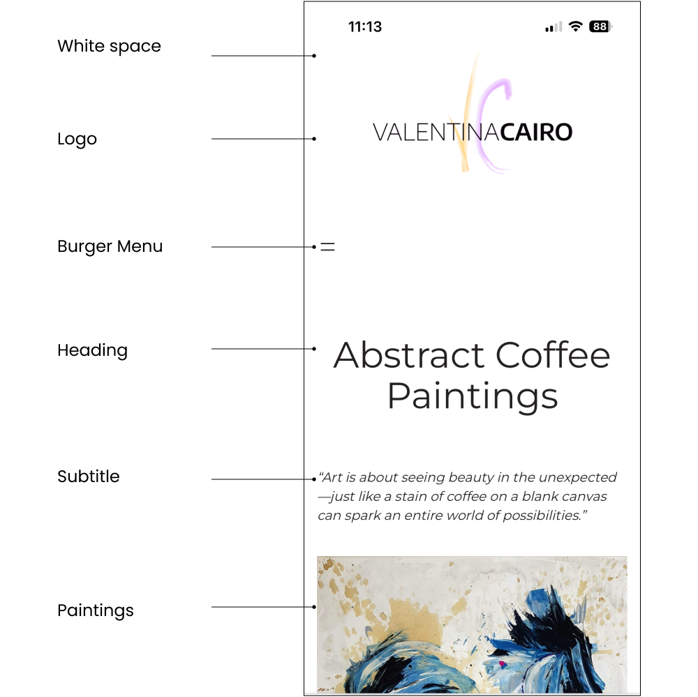
White space: A bright, minimalist design with a white background to let the vibrant artwork take centre stage.
Logo: Big logo, easy way to go back to the Homepage/Landing page
Burger Menu: Not really easy to spot and ond the left site so not easy to reach with one hand. Maybe better tu have it in the centre of the page. Follow-up.
Heading: Title large and prominent to introduce the type of paintings (in this case the paintings painted with coffee.).
Subtitle: Subtitle with a phrase from the artist that can introduce the user to the works exhibited below.
Paintings: Carousel of images proposed one after the other in order to leave each one the right space and the right importance.
About the process: how the artist works
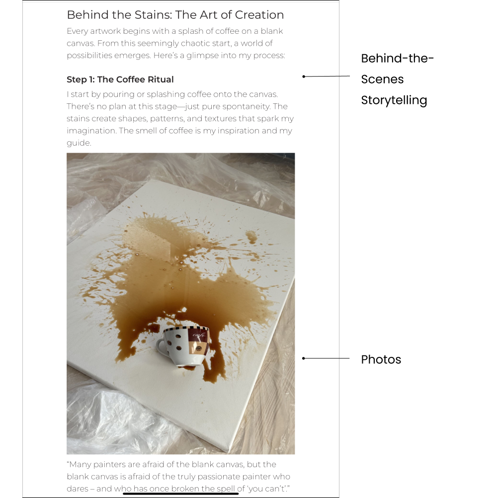
Behind-the-Scenes Storytelling: Looking at social media like Pinterest and Instagram, you can see that the most viewed photos and videos are those that tell the story of the journey to the final work rather than the work itself.
Photos: To meet the growing demand for storytelling in art, I have introduced a “Behind the Scenes” section embedded in the Abstract Coffee Painting page. This includes a series of photos that document the creation of abstract coffee-inspired pieces, and a small description of the process, offering viewers a deeper connection with the artwork.
Contact Integration
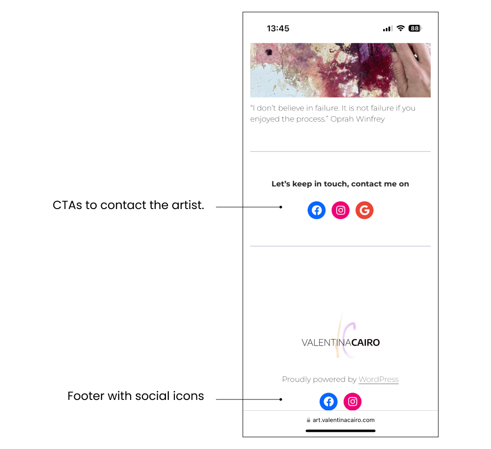
Let’s keep in touch: To address the lack of clear communication options, I added final CTAs at the end of each page encouraging users to connect with the artist.
Header & Footer: A header and a footer containing Social icons for quick reference.
Phase 4: test the solution
I conducted usability tests on the prototype with 5 users to evaluate the new design. The results were overwhelmingly positive, but I made some adjustments based on user feedback:
- Burger menu: On the mobile version the burger menu is on the left side and it is not easy to spot nor to reach.
- Contact Accessibility: While the footer and header contact options worked well, one user suggested adding a “Contact the Artist” button directly under each artwork description. This is definitely a great place to start a new search.
- Pricing: There are no prices, so it is unclear whether the artist wants to sell their artwork or not. Perhaps I could add a simple sentence near the “Contact the Artist” CTA to explain to contact the artist for more details.
Wrapping up
Once upon a time, an outdated and unclear art portfolio prevented an emerging artist from properly showcasing their work and connecting with potential buyers. Users found the site confusing and uninspiring, with missing descriptions, hard-to-locate contact options, and no storytelling about the artistic process.
Every day, the lack of clear information and structure discouraged visitors from engaging with the portfolio. Frustrated users left without contacting the artist or exploring their work in depth.
Until one day, I stepped in to redesign the portfolio with a user-centred approach. Through research, usability testing, and iterative design, I transformed the site into a fresh and modern portfolio that prioritised clarity, storytelling, and user engagement.
Because of that, users could now explore vibrant artwork on a clean, bright interface, learn about each painting’s story, and easily reach out to the artist.
Until finally, the new portfolio became an effective showcase for the artist’s work, building deeper connections with art enthusiasts and inspiring more inquiries and sales.
And every day after that, the portfolio continued to delight visitors, allowing the artist to stand out in a competitive art world.
