UI Case Study Project: ONLINE BANK
UI Design
About the project
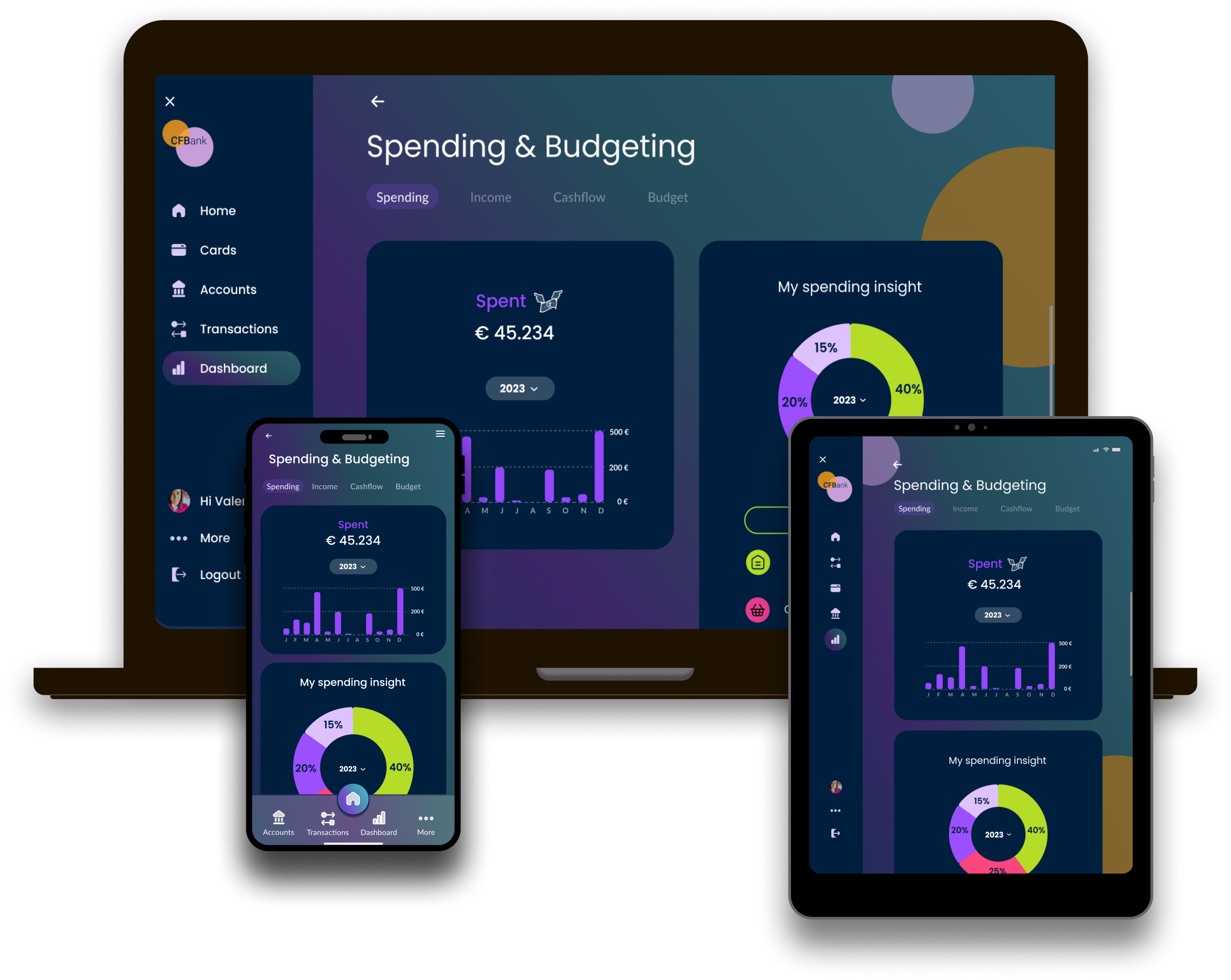
I designed this user interface for a banking application. My client is a fictional challenger brand, CFBank, a new competitor to the traditional banking institutions. They want an intuitive interface that will help them stand out from the crowd.
I created a fresh new interface that works across desktop, mobile and tablet devices. I particularly focused on these screens:
- Accounts overview screen – assuming the user has already logged in, I designed their banking home screen. It shows an overview of their accounts (current, saving, joint accounts) and some navigational elements to proceed to other screens.
- Current account screen – their day to day spending account. They can find here their recent transactions and quick links to regular payees.
- My spending screen – a page to help users manage their finances, offering insights into their spending habits and tools to set and track budgets.
Project goals
- Create a design that works responsively across each screen type.
- Create a design that reflects the brand principles: playful, clear, and trustworthy.
Phase 1: research and moodboard
A key consideration for this UI project was the tone, personality, and values of the brand. I determined the exact personality of my banking application, but I kept the brand guidelines in mind: Clarity, Playfulness, Trustworthiness.
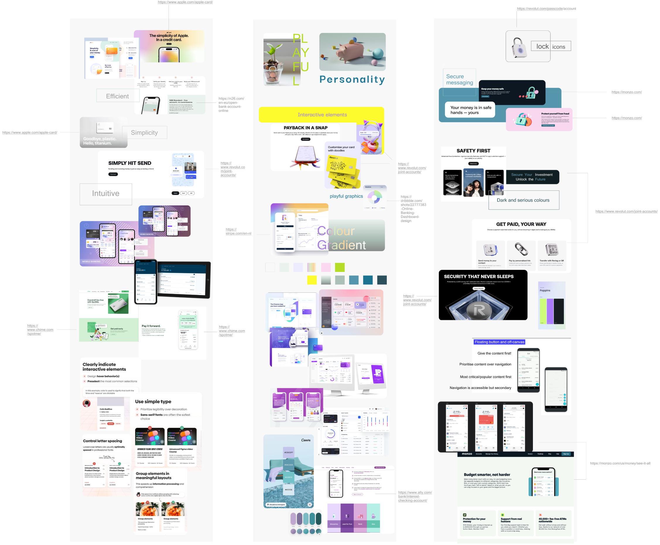
A mood board of visual references was a valuable source of inspiration for me and an effective way to share my ideas.
I researched my competitors (existing banking websites/apps) and took inspiration from the market.
I looked for other websites/products/designs that represented and communicated the qualities of my brand:
- Clear – I found websites or apps that leveraged white space and clear typography to make their designs easy to use.
- Playful – I found websites or apps that showed their playful side through the use of color, shape, animation, or illustration.
- Trustworthy – I found websites or apps that conveyed a sense of trustworthiness through their designs.
Phase 2: create a design system
I created my own Design System inspired by famous design elements libraries on the web, like Google Material Design, Cupertino Apple design system, Fluent 2 Design System – Microsoft Design and Workday Canvas Design System. I was also inspired by well-known and successful online banking apps such as Revolut and N26 and by websites and apps of banks such as ING and ABN AMRO (Dutch bank). To create the brand’s tone of the CFSafe Bank I took into consideration Content, Layout, Typography, UI elements, Spacing, Colours and Icons.
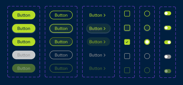
Input controls
I gave the CTAs as much affordance as possible, creating a grid with the different states. I used a bright green and rounded edges to maintain the playfulness of the brand.

Typography
Why Poppins for Headlines:
- Playful: Poppins has a slightly bouncy and friendly feel, which aligns with the “playful” aspect of our bank brand.
- Clear: Poppins is a clean and readable font, ensuring our headlines are easy to understand at a glance.
- Modern: Poppins has a contemporary aesthetic that feels fresh.
Why Lato for long Text and CTAs:
- Clear and Readable: Lato is known for its excellent readability, making it perfect for body text and CTAs (call to actions) on our website. Users will be able to easily understand the information and take desired actions.
- Versatility: Lato comes in a range of weights (thin, light, regular, bold, black) We can use lighter weights for body text and bolder weights for CTAs to create visual hierarchy and guide users through the website.
Their combination can create a website that is playful, clear, and trustworthy.

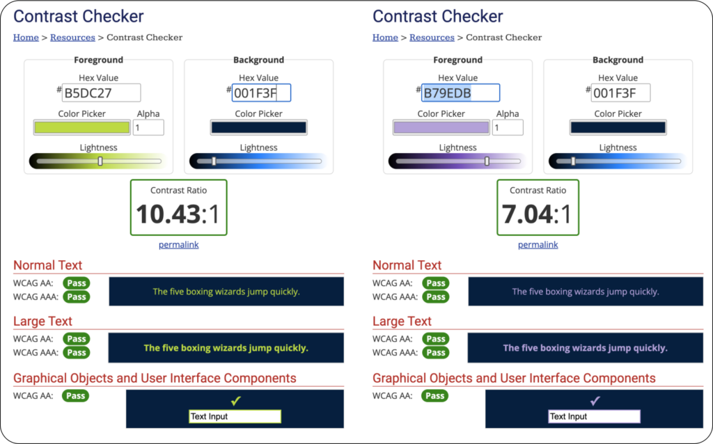
Accessibility
A good design should be good for everyone who need it. For this reason I looked for the perfect combination of size, color and contrast.
Phase 3: screen design iterations
This is a phase in constant evolution. The UI of a web product can be continuously improved. I started with simple sketches on paper and then moved on to wireframes. Below are some examples of how I went through some of the problems I encountered.
Fictional credit cards
The text on the credit cards is too small and the shadows under the text make it unreadable. To make them look like actual cards I need more space and making them small to fit on a mobile device adds visual noise and confusion.
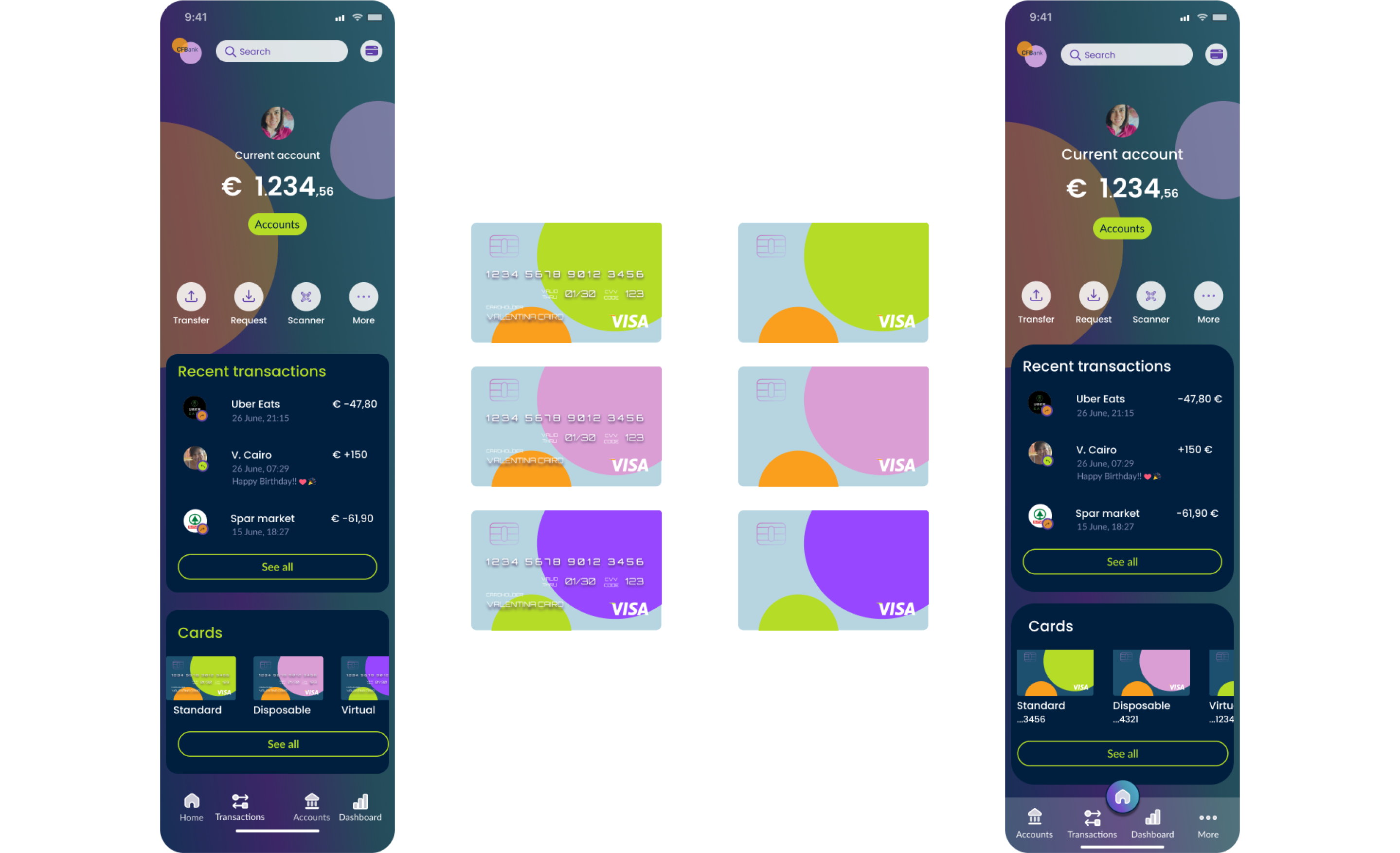
Hence my decision to erase the text, leaving only the play of colors in the background (with the spheres that recall the logo design) and the choice to write the name and last 4 digits under the credit cards.
Which background is better on tablet and desktop?
I find the gradient background more playful and the dark blue background more elegant with a strong idea of security. It was not easy to decide between the two.
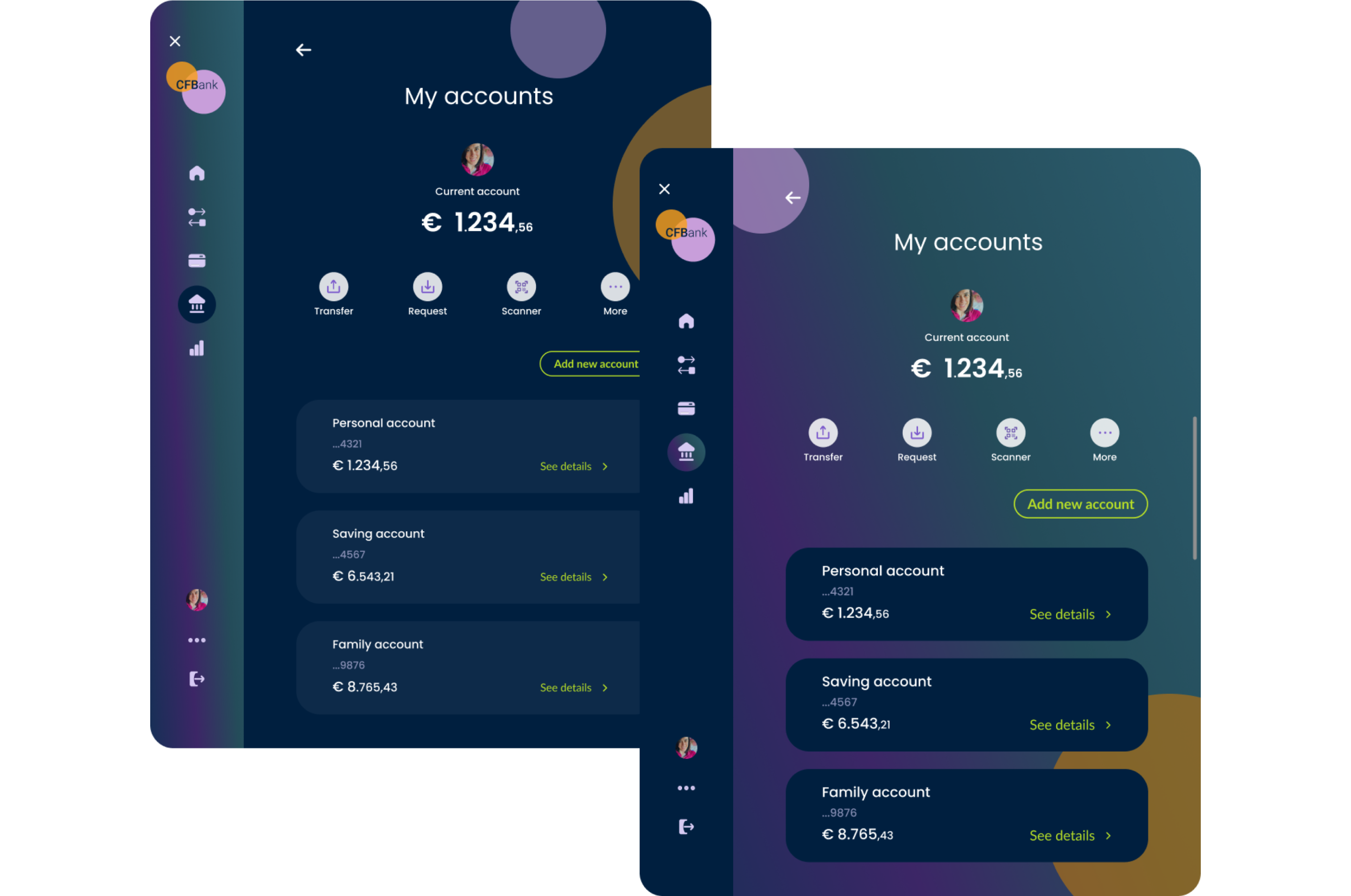
My personal taste would have made me choose the one with a dark and uniform background but my final choice went to the one with a background with gradient for two main reasons:
- there is more consistency with the mobile background.
- the cards are more visible.
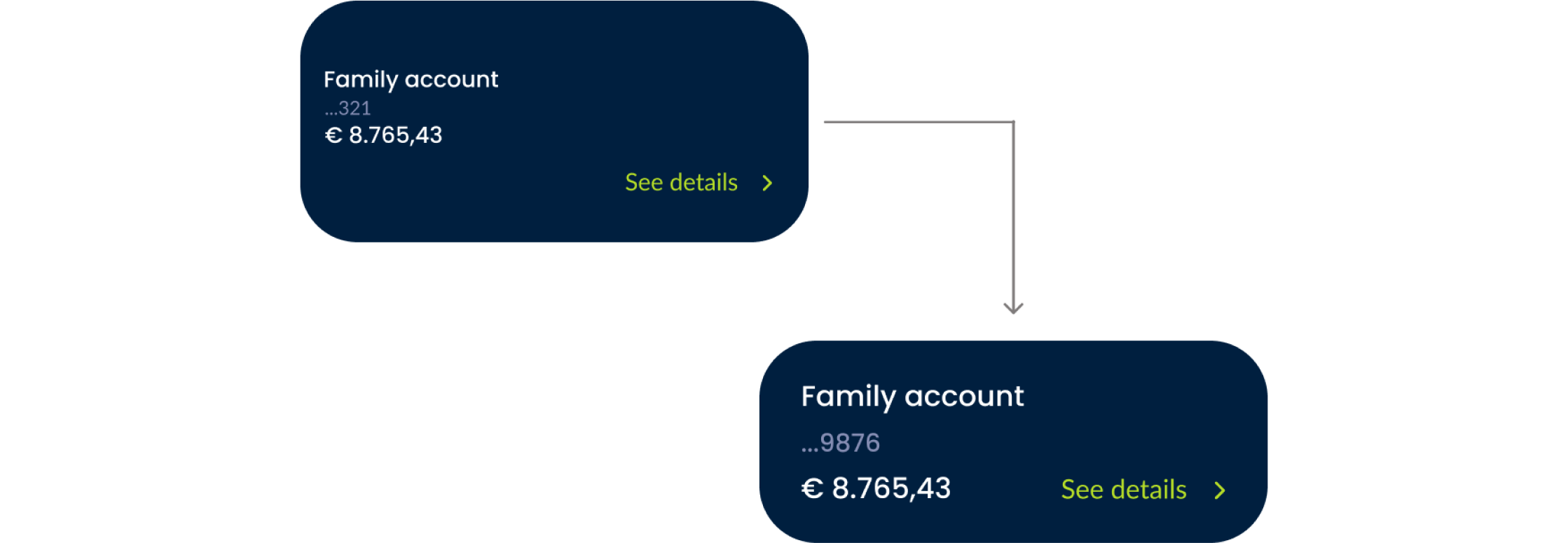
Improving the UI: save space and user’s time
Amounts and See details better on the same line to avoid empty space and lead the user smoothly and quickly through the UI.
The navbar evolution
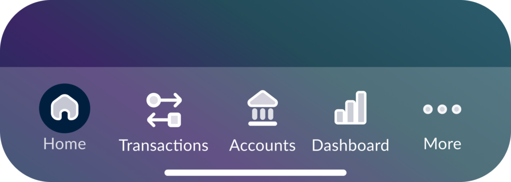
First iteration: Too many icons in the navbar can confuse the user and be pressed by mistake because they are too close to each other. Therefore the choice of using a floating button integrated into the navbar.
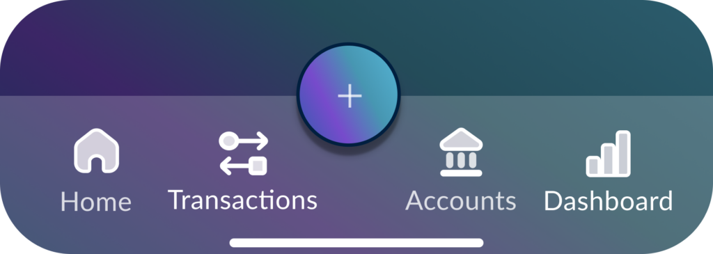
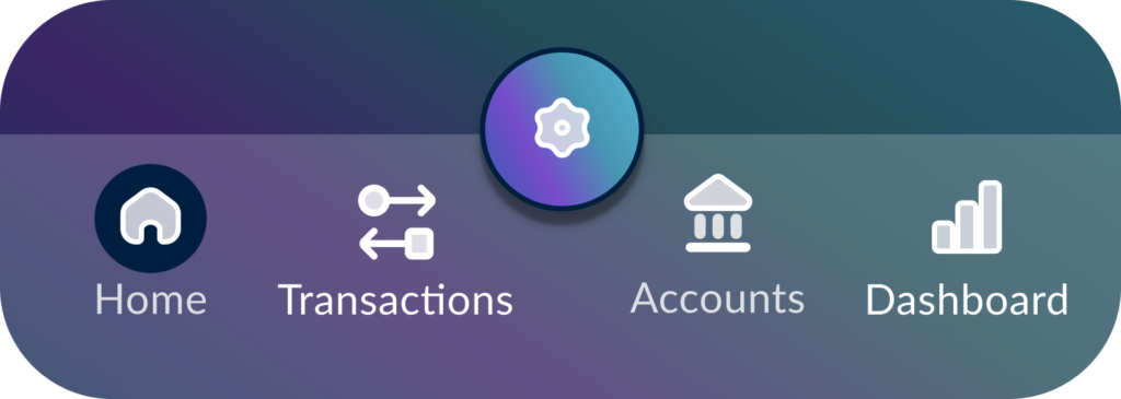
Second iteration: Initially, I opted for a floating button with a ‘+’ icon integrated into the navbar. I replaced the icon with a gear to avoid confusion, as the ‘+’ could suggest adding something instead of settings.
Third iteration: Maybe settings is not a great choice to have as a main button, that button should be set to the most used action, like viewing your accounts (home) or sending money. Settings does not need to be highlighted as it’s not visited that often.
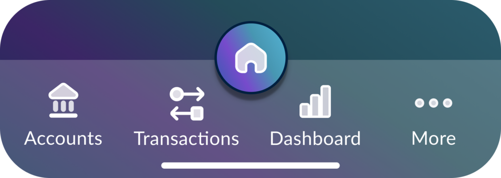
In the end: I preferred to use the centre button as ‘home’ rather than for ‘settings’, as the latter is a less frequently used function by users.
The filters button
I initially used a primary button that however gave too much emphasis and made it a CTA.

The choice to use filters must not be a priority for our users but an aid to speed up the process and reach their goal more easily. I therefore chose to change the button to a secondary one.
Phase 4: final screen designs
My accounts
Account List & Overview where users can see a list of all their accounts with key information like account name, type, and current balance. This layout enables users to quickly scan and locate the account they wish to manage. By selecting an account from the list, users can access a more detailed view.
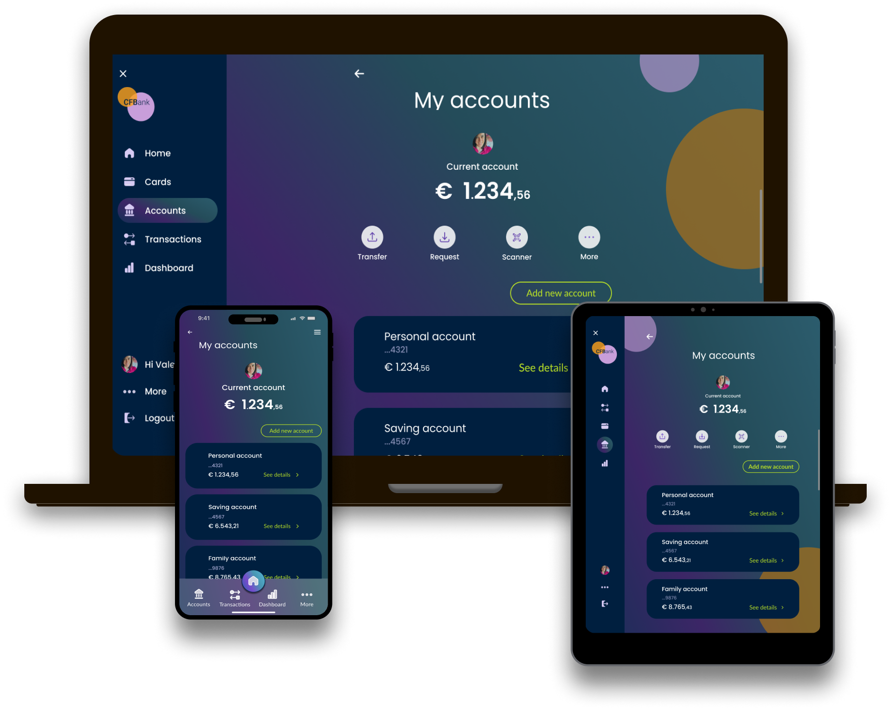
Users also have the option to create a new account through the secondary button ‘Add new account’.
On the screen designed for desktop and tablet it is also possible to quickly access important operations such as transferring or requesting money while on mobile, for space reasons, the same operations are on the homepage.
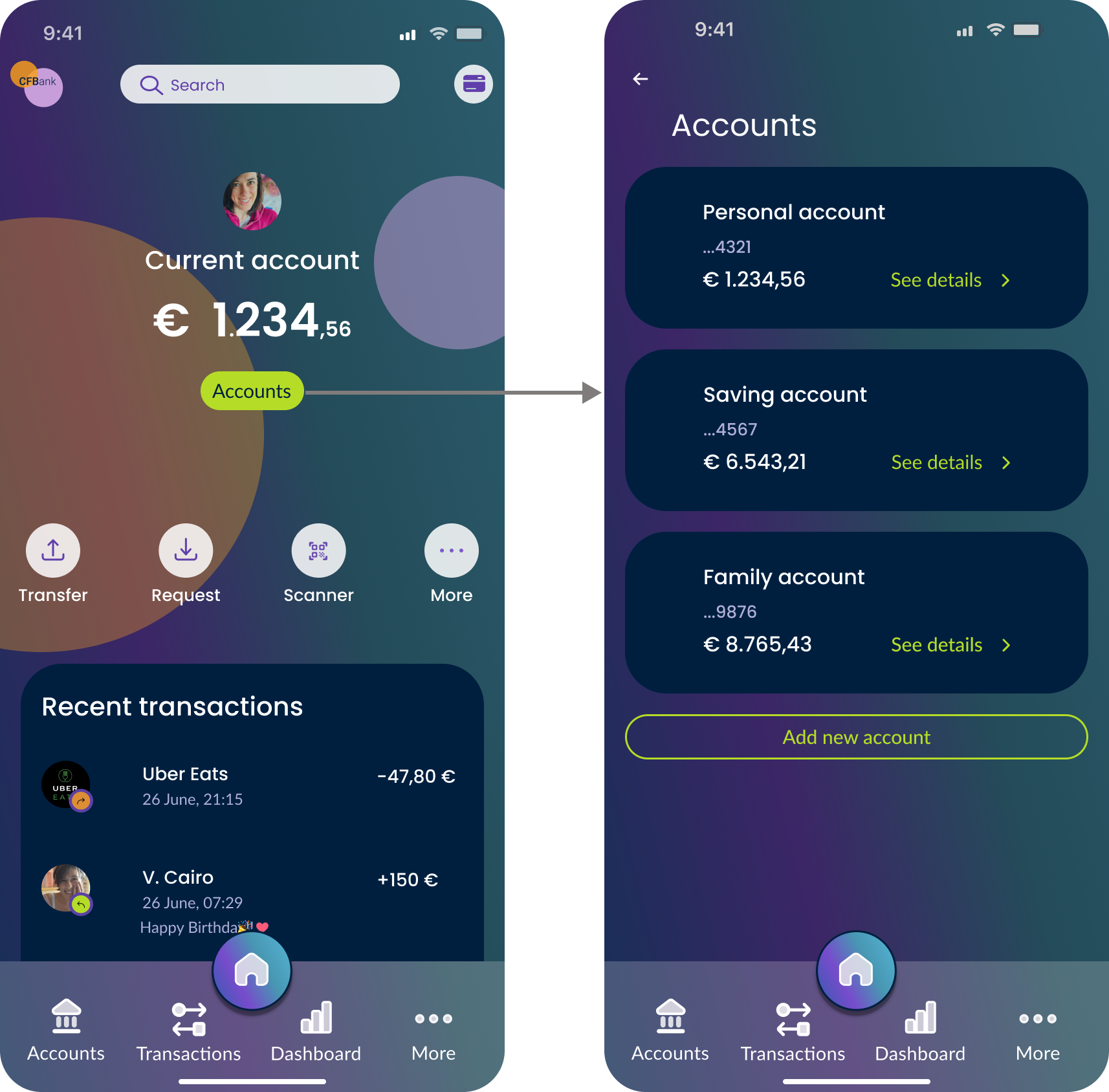
The homepage of an online banking platform on the mobile is typically the first place users see when they log in, so I designed it to provide a clear, concise, and intuitive overview of their financial status. It balances simplicity with functionality, giving users quick access to the most important information and actions.
Current account
A screen that shows the user’s recent transactions to/from their checking account.
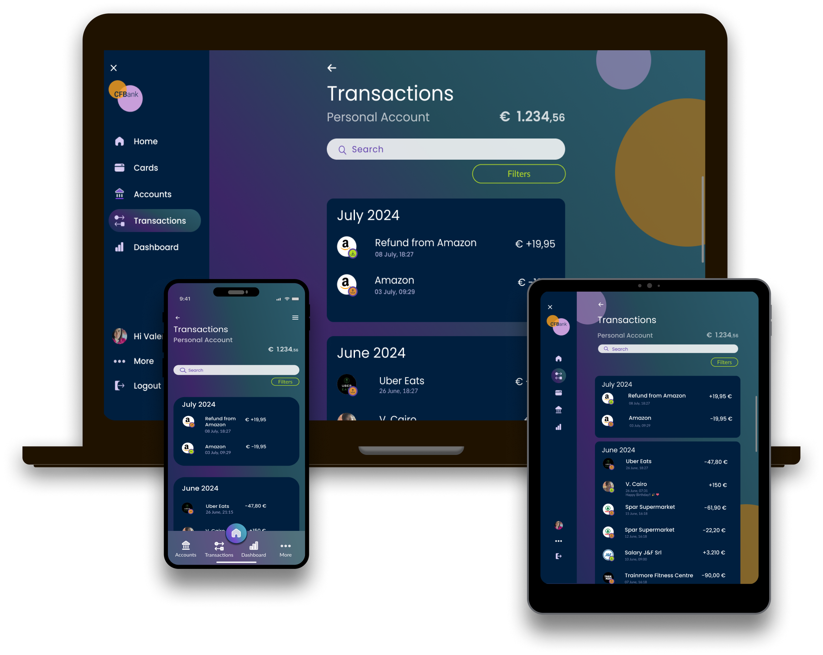
Designed to help the user narrow their search through a search bar and a filter button.
It is always possible to go back to the previous page or choose another page through the navbar on mobile or the left hand navigation on tablet and desktop.
My spending
A page designed to help users manage their finances, offering insights into their spending habits and tools to set and track budgets.

The user also has the ability to easily switch between the Spending page, Income, Cash Flow, and Budget pages.
It is always possible to go back to the previous page or choose another page through the navbar on mobile or the left hand navigation on tablet and desktop.
Wrapping up
Imagine stepping into a world where banking isn’t just a boring and necessary chore but a delightful experience. That was the vision for CFBank, and I was tasked with bringing it to life. By immersing myself in their brand values, I crafted a design that was as playful as it was functional. From the initial mood board to the final screen designs, every decision was guided by the desire to create a design that was as playful as it was clear. One of the biggest challenges was balancing the playful elements with the need for trust and security. Through countless iterations, I discovered the perfect blend of colours, typography, and imagery that conveyed CFBank’s personality while ensuring a seamless user experience. Each iteration brought me closer to the desired outcome, but it was the combination of these elements that ultimately captured the essence of CFBank’s brand. The result was a design that not only reflected their playful personality but also instilled a sense of trust and security in their customers.
