UX Case Study Project: Hotel Website
Complete UX Process
About the project
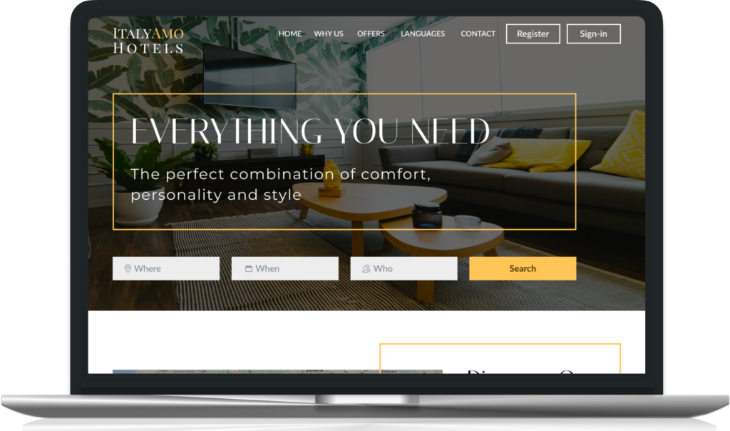
I focused on a fictional client who owns an Italian hotel chain with 52 hotels and resorts throughout Italy.
They noticed that with their old website a lot of people started the booking process but only few ended with the booking confirmation step.
Role & responsibilities
- interviewing customers, conducting usability tests,
- competitive benchmarking and online surveys,
- creating affinity diagrams, customer journey maps, flow diagrams,
- sketches, prototypes and annotations,
- created high fidelity wireframes to show the full product experience.
Project goals
Improve the desktop website experience to increase the number of people who complete the booking process.
Phase 1: research
Identify the problems
In this phase I focused on identifying the user’s problems and needs:
- Online surveys: the thing that stands out the most is that most users prefer to book on a hotel aggregator website/app (Booking.com, Airbnb,…).
- Therefore I conducted the competitive benchmarking on hotel aggregators such as Booking.com, Airbnb, Expedia, Ibis Hotel. I focused on conventions and practices: what is standard and familiar? What are they doing right and wrong?
- 5 Usability test sessions conducted on 4 different hotel websites. Why? Our client is the owner of a fictional hotel chain, and we didn’t have a real hotel website to analyse. I chose to base our usability tests on 4 different hotel websites to gather insights, helping us build a great new hotel website without any friction.
Highlighted pain points
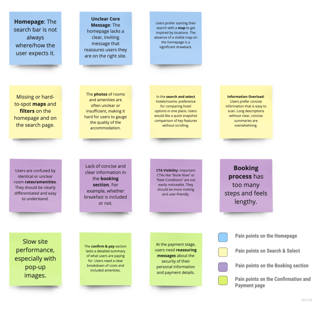
Phase 2: analyse the research data
Affinity diagram
The research revealed valuable insights, points of friction, and opportunities for improvement. I organized and defined the core problems by structuring a large volume of raw data.
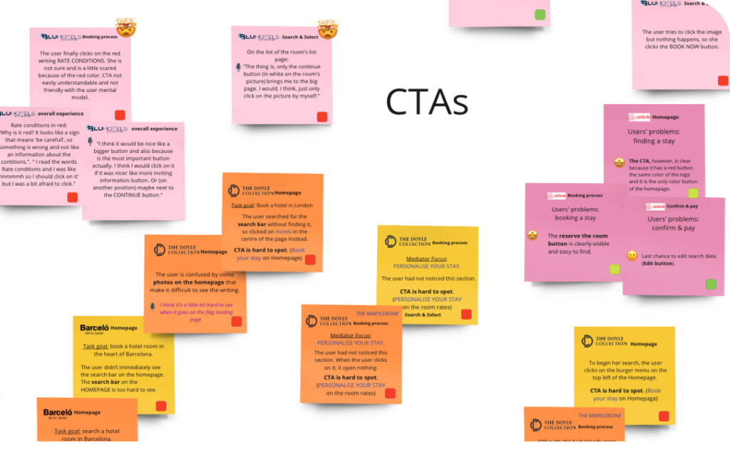
Using the Affinity Diagram technique, I transformed this messy data into clear, structured information, making it easier to analyze and act on.
Storyboard & customer journey map
Additionally, I employed storyboards and customer journey map—two powerful techniques that helped me pinpoint key moments in the user experience during the booking process.
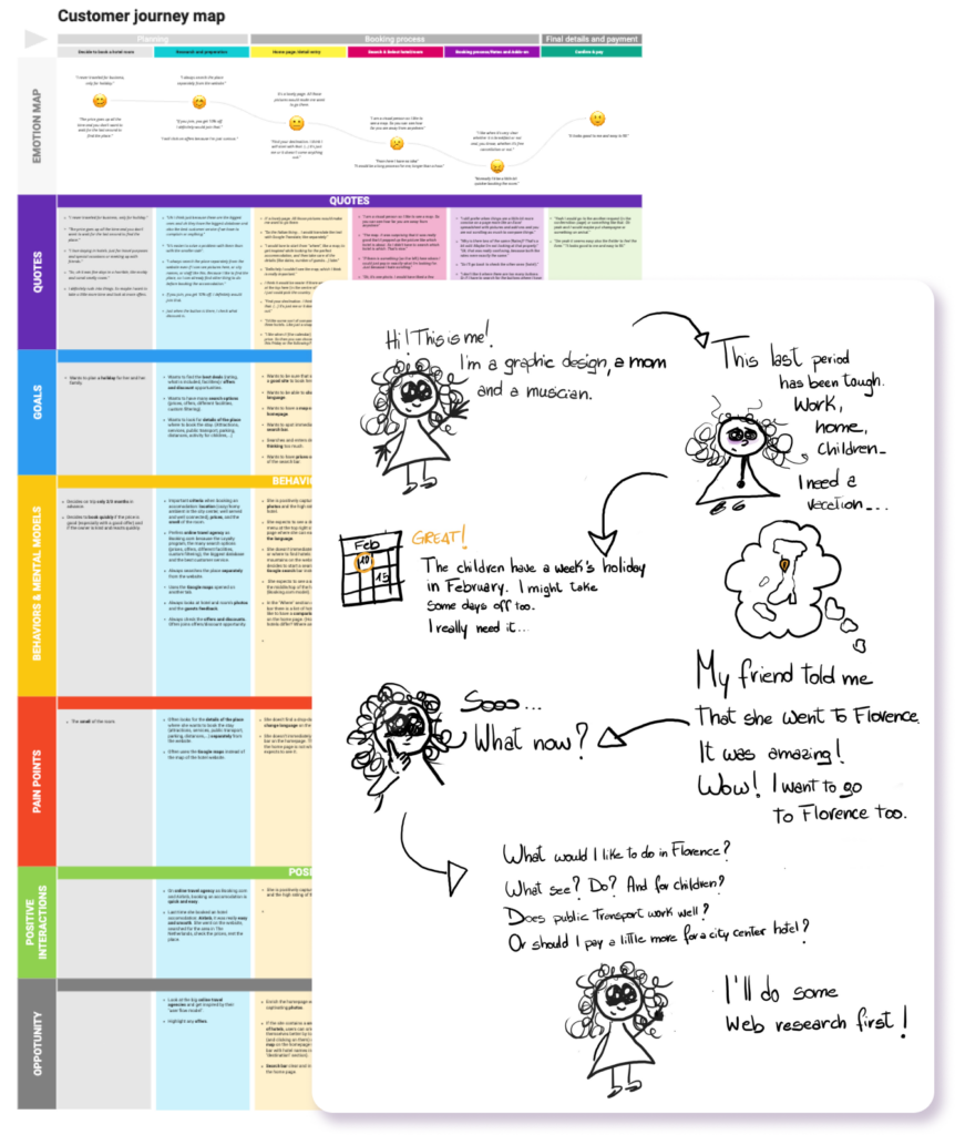
These tools allowed me to answer essential questions like: When does the journey truly begin? What steps did the user go through? Was it an enjoyable experience from start to finish? What did she appreciate, and what challenges did she face?”
User flow
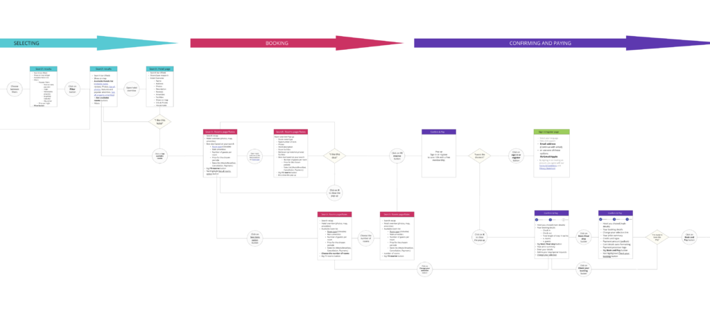
Finally, I used the User Flow technique to map out the complete sequence of actions a user would take, ensuring a smooth and logical progression through each step of the booking process.
Phase 3: defining the UI
Let’s solve the problems!
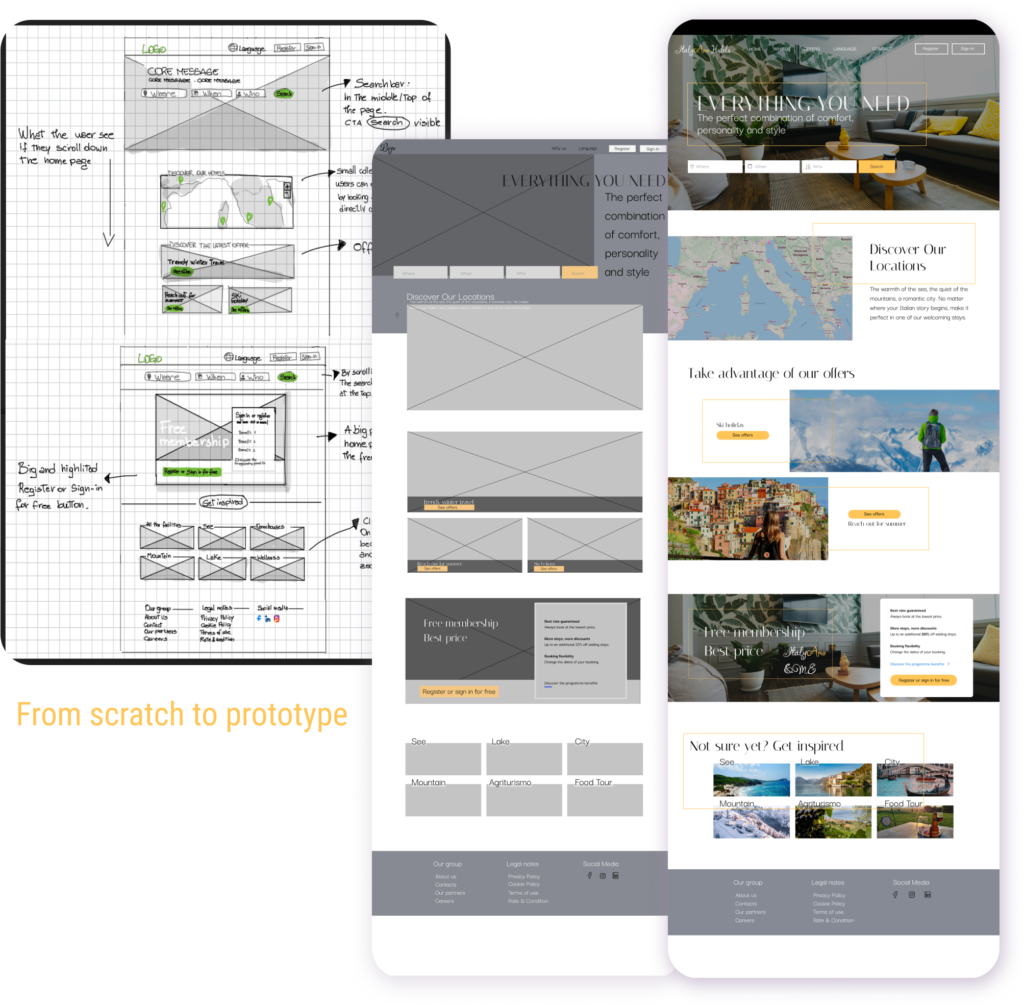
The process so far has helped me define and articulate the problem, identifying numerous points of friction and opportunities for improvement. This served as a framework for me to design effective flows and interactions, which later guided me to implement and test the solution.
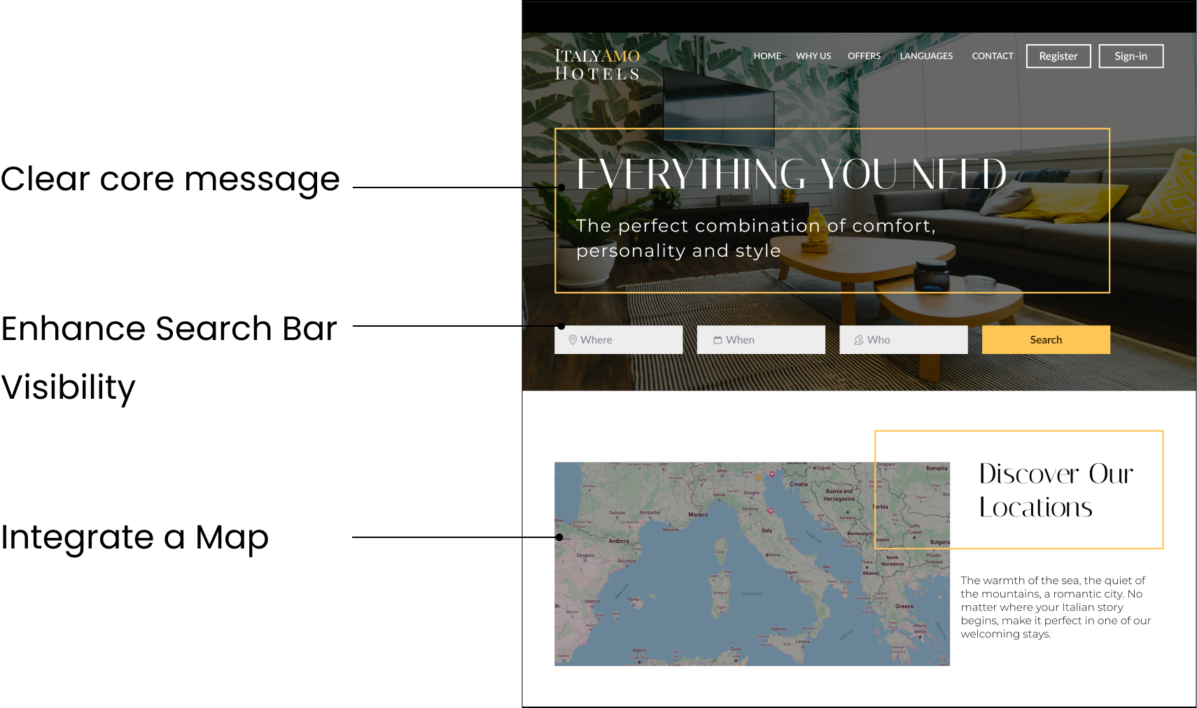
Homepage: simple and intuitive navigation
Clear core message: Inviting message that reassures users they are on the right site.
Enhance Search Bar Visibility: Place the search bar prominently in the middle or top of the homepage.
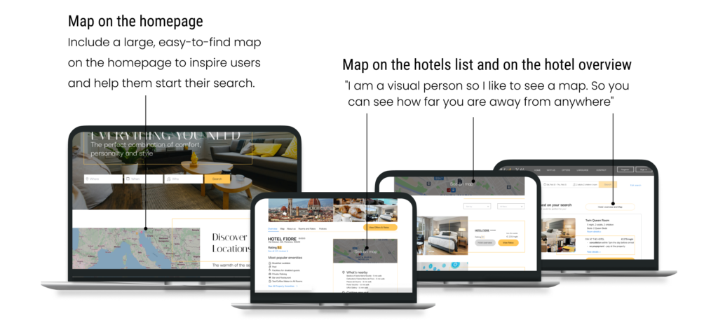
Integrate a Map: Include a large, easy-to-find map on the homepage to inspire users and help them start their search. “I would love to start from ‘where’, like a map, to get inspired while looking for the perfect accommodation.”
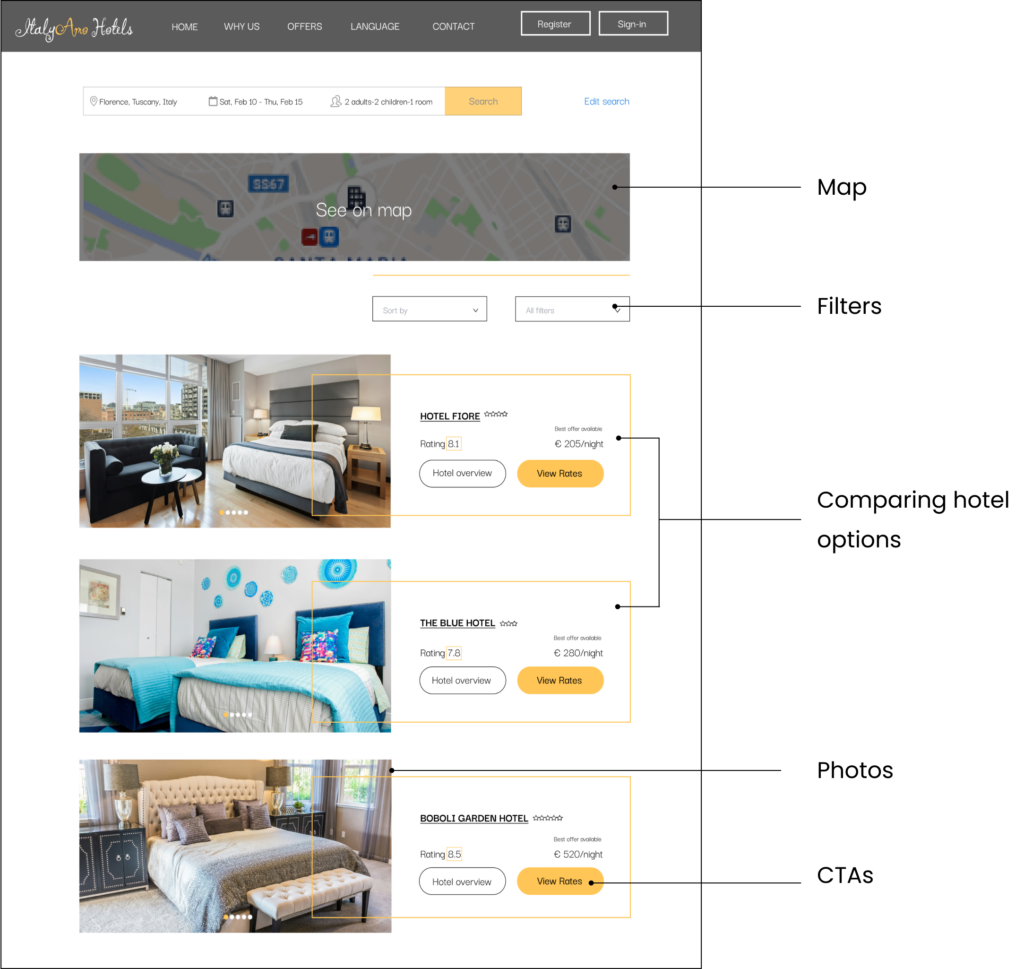
Search & Select: efficient and user-centric
Map: I’ve included a large, easy-to-find map on the hotel listing page to help users better understand the location of the hotels. “Definitely I couldn’t see the map, which I think is really important.”
Filters: The filter button is easily visible, but not highlighted as a CTA. “If there was something here where I could just pop in exactly what I’m looking for. Just because I hate scrolling.”
Comparing hotel options in one place, a quick snapshot comparison of key features to avoid users scrolling too much.
Photos: High-quality and attractive photos of rooms and hotel facilities.
CTAs: Non-highlighted button to view an overview of the hotel and highlighted button to speed up room selection and confirmation.
Booking process: clear and concise
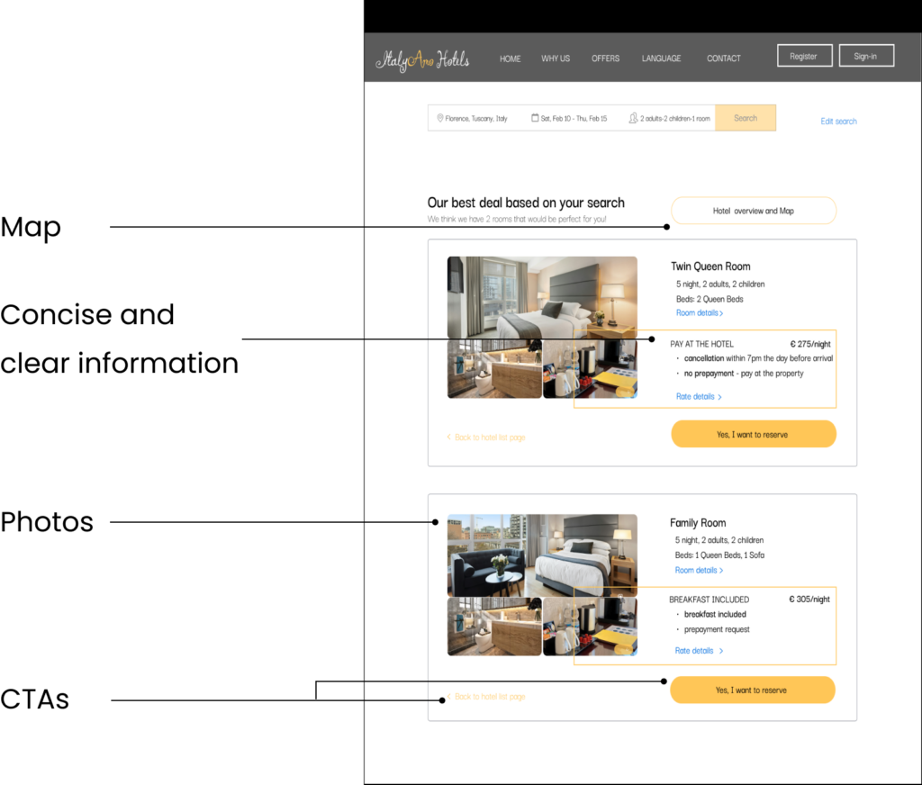
Map: Secondary CTA (not highlighted) reassures users that they can always see more information about the hotel and the hotel map if they need it.
Concise and clear information: The user can easily and quickly find what he is looking for (Room details, breakfast, payment type, rate details…)
Photos: High-quality and attractive photos of rooms and hotel facilities.
CTAs:
- Highlighted button to speed up the booking process and stay confirmation. Clear CTA that speaks user’s language – ‘Yes, I want to reserve’.
- Freedom and control: tertiary button ‘< Back to hotel list’.
Confirm & Pay: detailed and reassurance
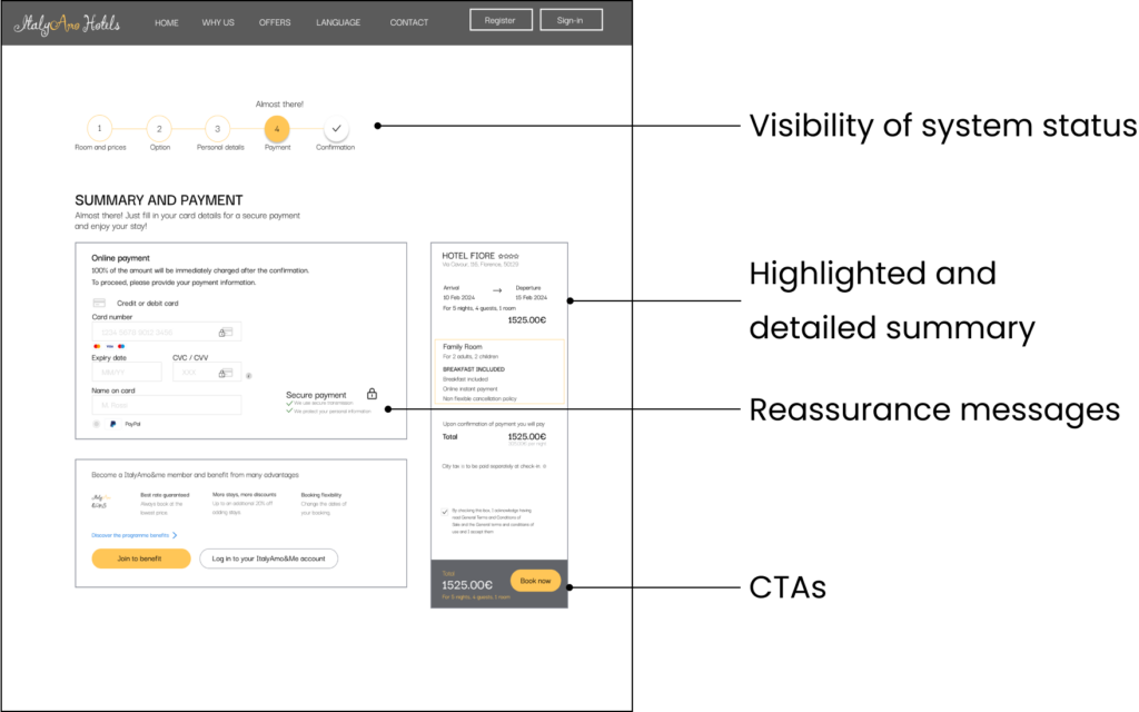
Visibility of system status: By telling the user there is only a step left, we reduce the feeling of overwhelm and encourage users to complete the process.
Highlighted and detailed summary of what users are paying for. Users need a clear breakdown of costs and included amenities.
Reassurance messages: Providing security cues like ‘Secure payment,’ ‘We protect your information,’ and lock icons helps build trust, making users more likely to finalise their booking.
CTAs: Highlighted button to speed up the booking process and stay confirmation. Clear and direct CTA ‘Book now’.
Attention to details
Phase 4: test the solution
I then conducted 3 usability tests on the prototype I created. The flow was almost frictionless from the homepage to the confirmation of booking. Obviously it wasn’t perfect (there’s always room for improvement!) and thanks to users observation I fixed various aspects of the website. Below one of these:
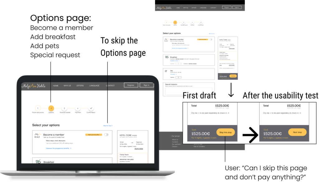
The first draft had a CTA ‘Skip this step’ next to the total amount. When a user added an option (becoming a member, breakfast,…) the CTA changed to ‘Next step’. During usability testing, a user thought ‘Skip this step’ referred to payment, so I changed the CTA to ‘Next step.’ Our goal is for users to add options, not skip them. However, to maintain user freedom (Nielsen’s heuristic), I included a less prominent ‘Skip options’ link at the top.
Wrapping up
Once upon a time, a well-known Italian hotel chain noticed that its outdated website was causing a significant problem: many customers had started the booking process, but only a few had made it to the final confirmation. This was hurting their business, as they had 52 hotels and resorts across Italy and wanted to offer guests a seamless experience.
Every day, users were struggling with the booking process on the website. Why? The lack of clarity ease resulted in frustration, leading them to abandon their bookings midway and turn to hotel aggregator sites like Booking.com or Airbnb instead. The hotel chain knew they needed a change but weren’t sure where to start.
Until one day, they decided to take a closer look at the problem and brought in a UX designer. My role was to understand the users, identify the pain points, and ultimately redesign the booking flow to improve conversions. Through interviews, usability tests, competitive benchmarking, and surveys, I uncovered key insights about what users truly needed.
Because of that, I realised users wanted a simpler, more intuitive experience. The idea of incorporating a map on the homepage and hotel pages became crucial, helping users explore locations before diving into the specifics. Because of that, I created high-fidelity wireframes and prototypes that streamlined the booking process. I added a map widget that allowed users to visualise hotel locations easily and redesigned friction points like the options page to make it clearer and more user-friendly.
Until finally, after several rounds of usability testing and iterative improvements, the booking flow became almost frictionless. Users could now navigate from homepage to booking confirmation with minimal confusion, resulting in a significant improvement in booking completion rates.
And every day after that, the hotel chain’s customers enjoyed a smoother, more intuitive booking experience. With a boost in user satisfaction, the chain saw an increase in completed bookings and customer loyalty, leading to overall business growth and success.
